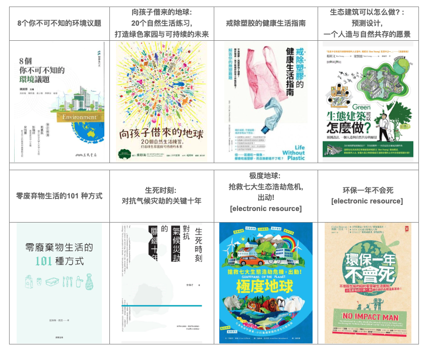
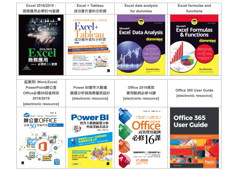
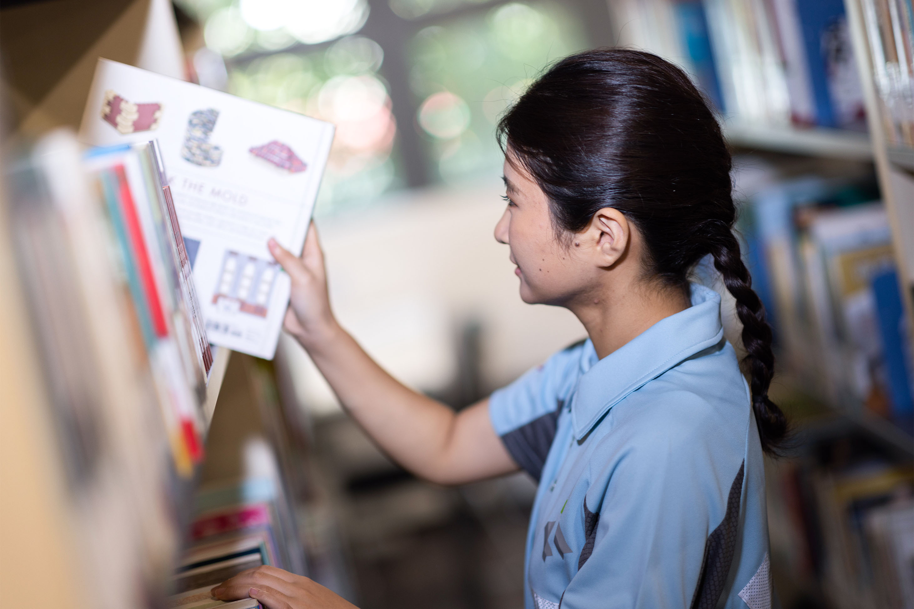
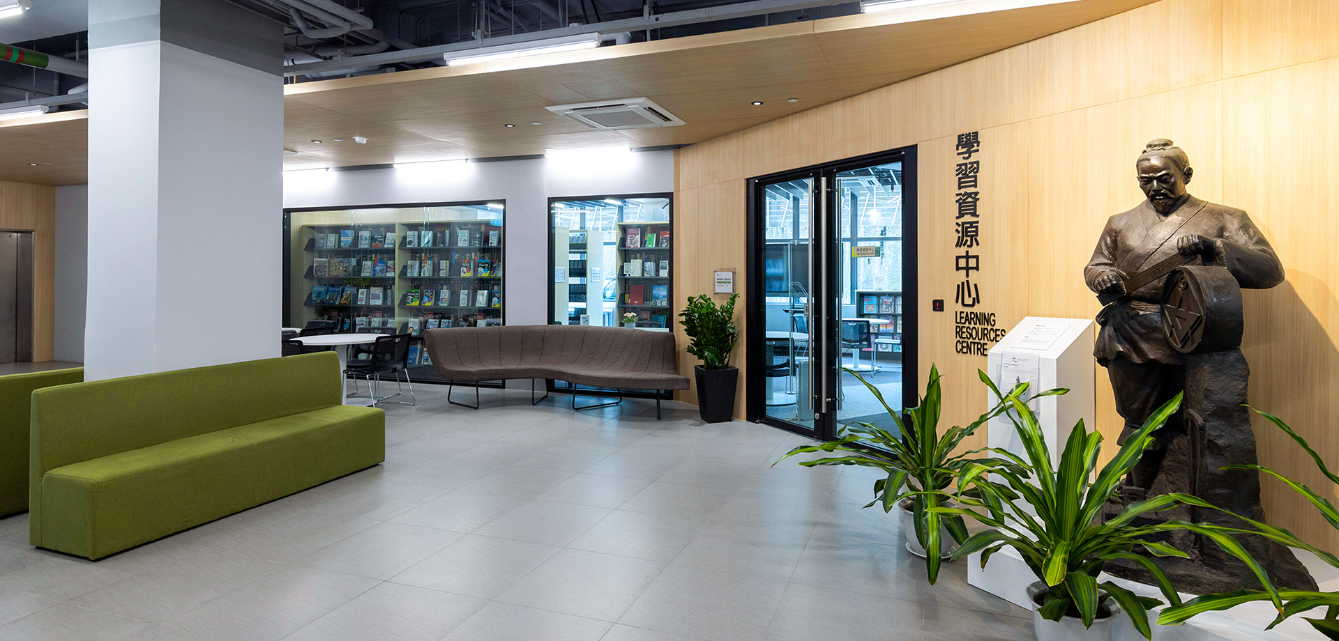
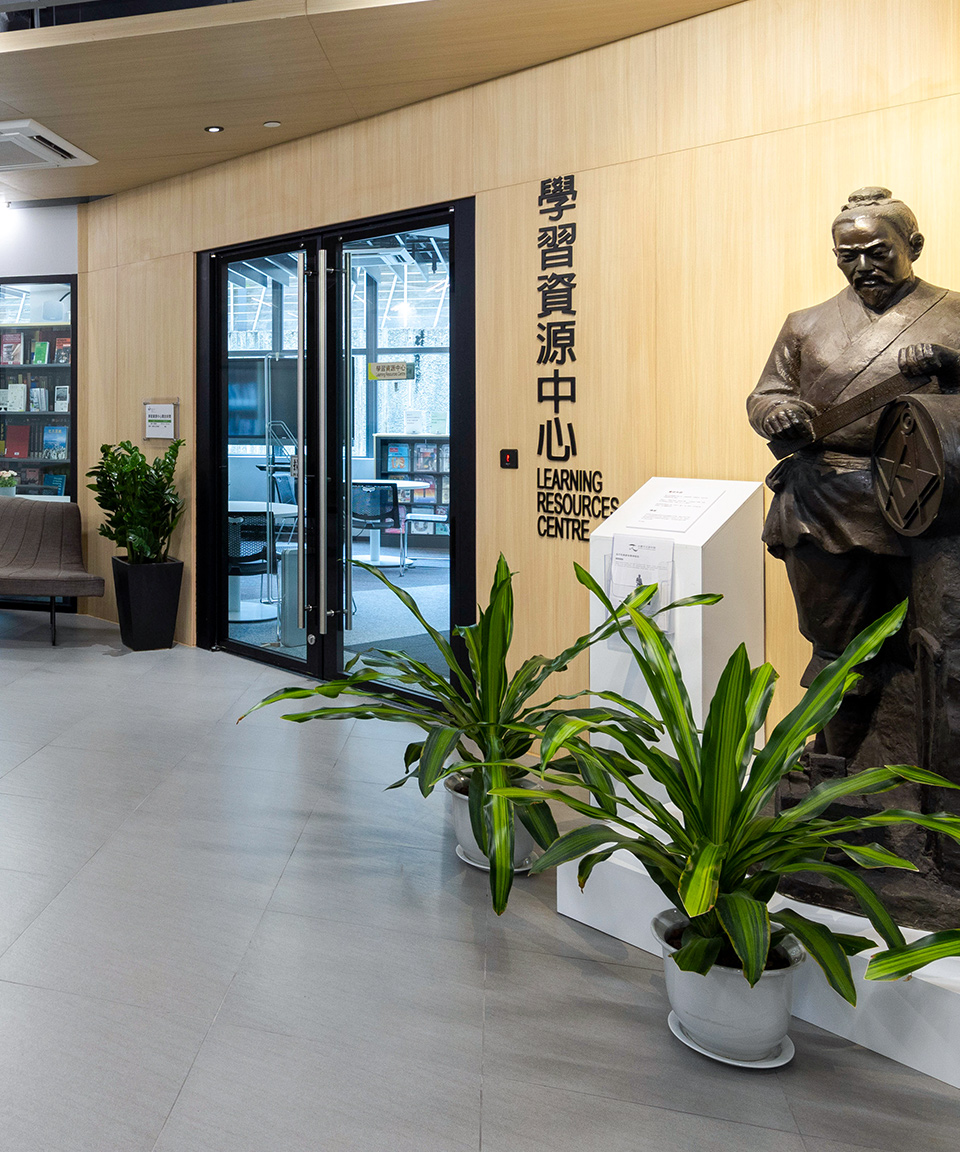
Search
About Us

Logo Design

The logo symbolizes that the campus of HKIC has a deeply-rooted foundation based on solid knowledge and professional skills. The green dot over the campus carries the meaning of hope and professionalism that leads to success and distinction.

The grey "I" and "C" shaped characters represent the timber structure based on mortise and tenon technique. The historical craft skills from ancient Chinese architecture today will become a source of pride for the new generation of construction professionals.

The Hong Kong Institute of Construction's logo is designed by a renowned Hong Kong designer and artist Mr. Stanley WONG (also known as anothermountainman). Since 2000, Mr. WONG has been creating a series of red-white-blue artworks made out of nylon canvas, which symbolize the positive energy of Hong Kong.


Search Course
Back to Top
All
Full-time
Part-time
1Interest
2Place
3Period
Step 1: Interest
Select your range of interest
Building
Civil Engineering
Electrical & Mechanical
Safety & Health
Project Management
IT-related
Environment Protection & Heritage
Others
Course Searching by Construction Idiom (Chinese only)
釘板
落石屎
紮鐵
金工/鐵器
平水/墨斗
燒桿
水電
Other
Back
Skip
Last Modify Time : 2022-12-01 09:15:21